iNSPIRED BY S*** QUALITY ON INSTAGRAM
For a while now, I've had it in my mind and occasionally mentioned to others that I thought I should start a blog. The word "blog" instantly transports me back to the early 2010's, was really one of my first forms of "social media" and feels a bit intimidating.
FUN FACT: I started many "blogs" as a young teen, but one of the first that I took more seriously was when I started to teach myself to bake and develop recipes in 2013/2014. I had just dropped out of university, still yearning for a career using my passion in photography, and was enamoured by other food bloggers and their photography of their baked goods. For about a year, I had a blog called "Savour The Sweet" where I posted vegan recipes that I had developed and photos of the goods, I had so much fun with it! This led me to my first job as a baker in a busy kitchen in Halifax, and is ultimately the reason I moved to the city in the first place.
It was a wildddd time.
Lately, I've been wanting a place to share my work that is my own, that is without risk of being removed, that doesn't trash the quality of my work, and that brings more people to my website (including me, I am terrible at updating this place and I want to be better!)
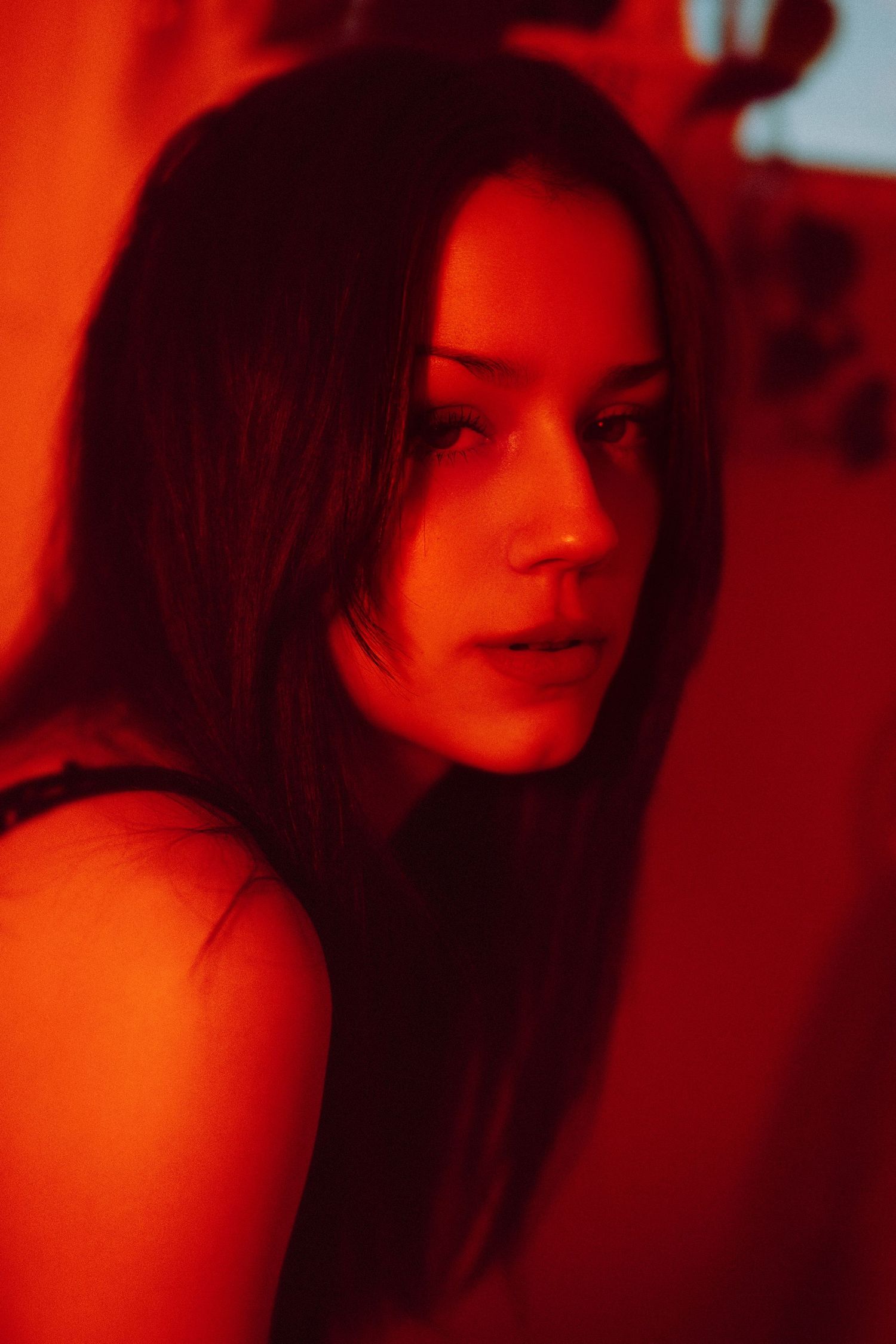
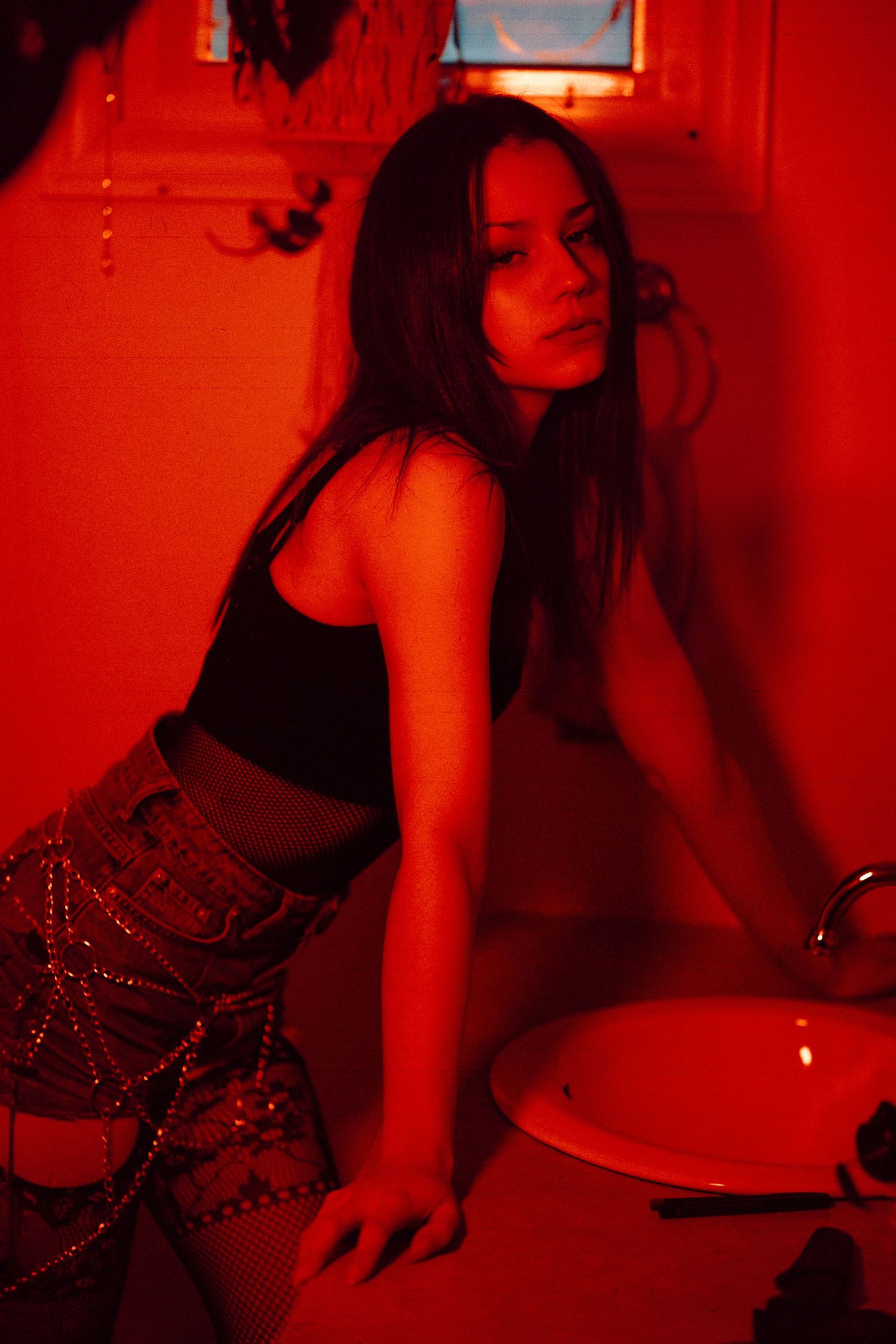
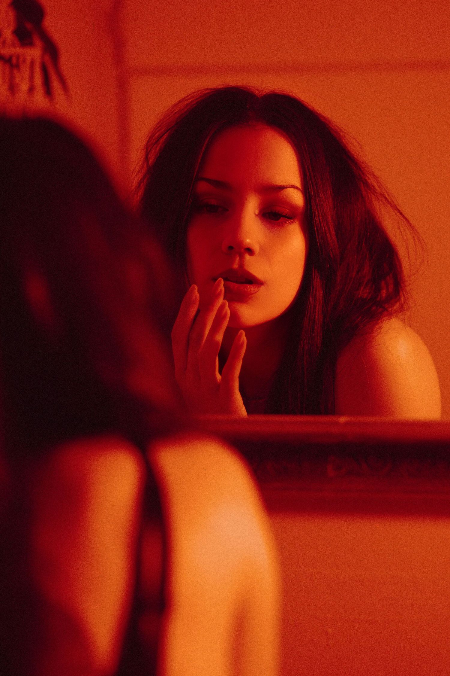
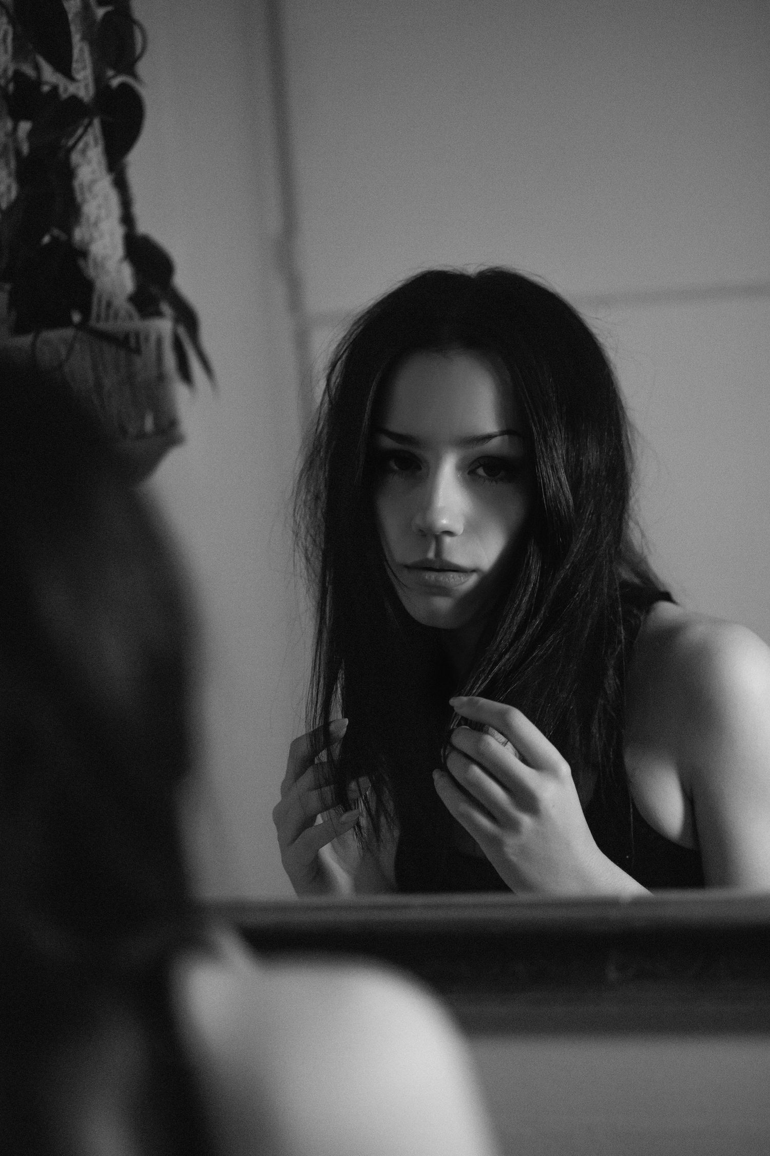
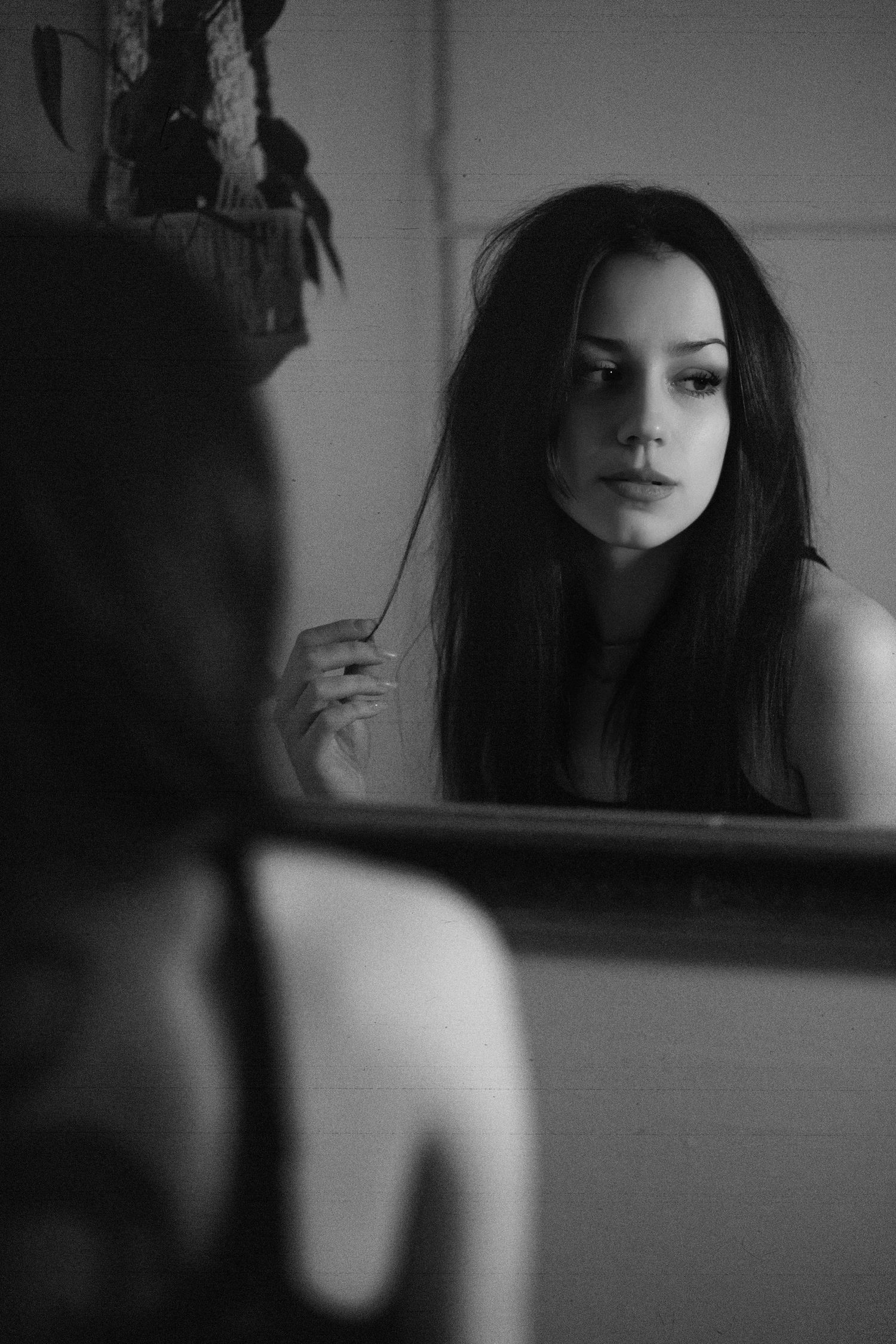
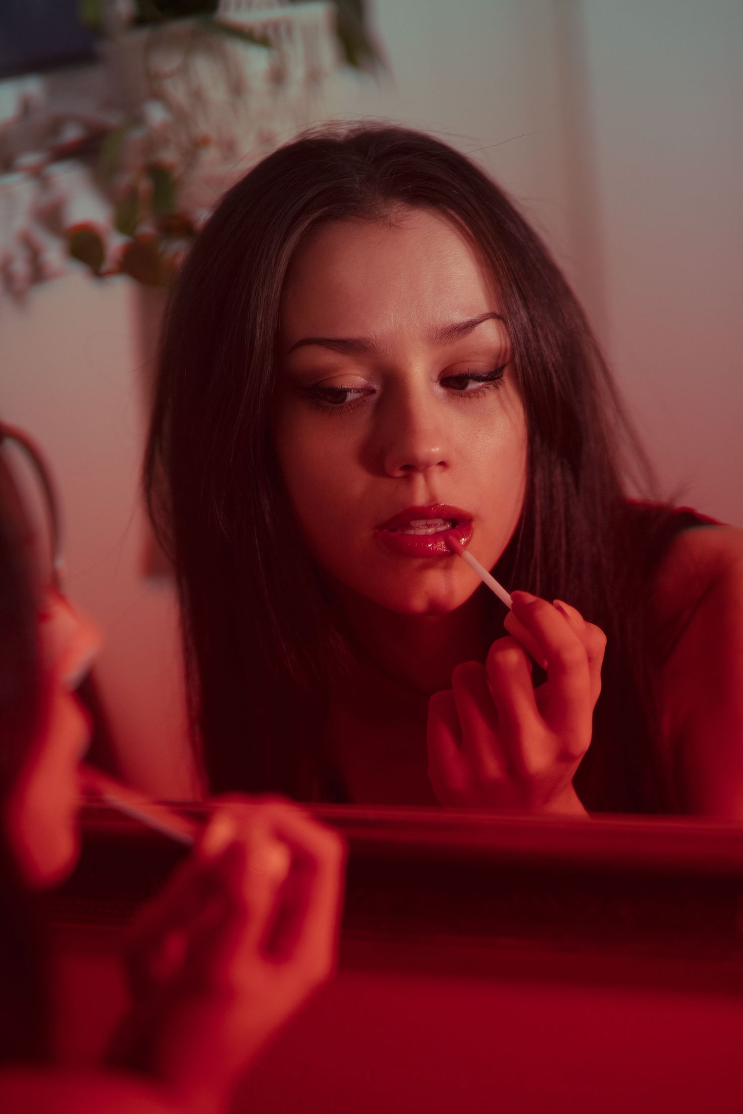
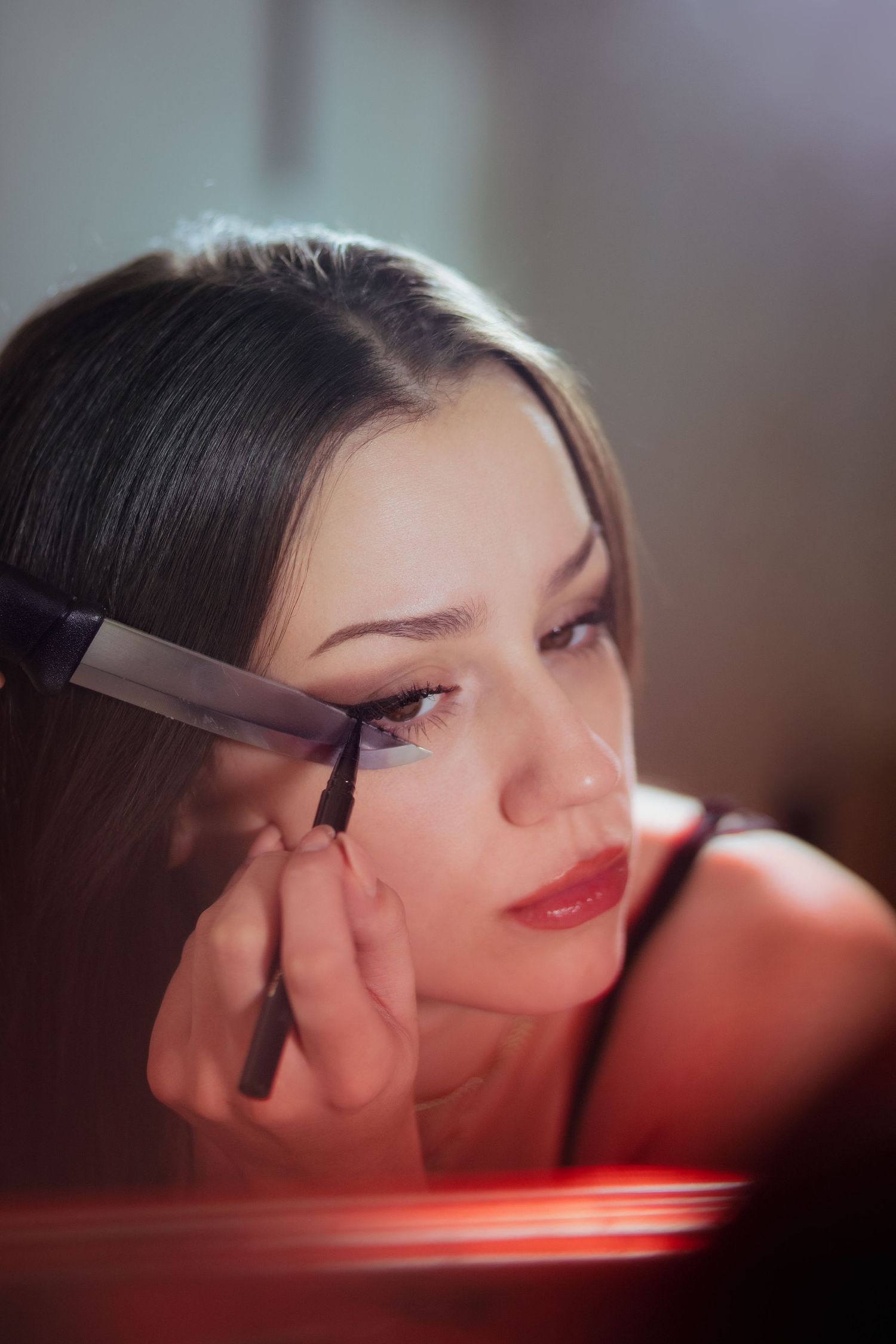
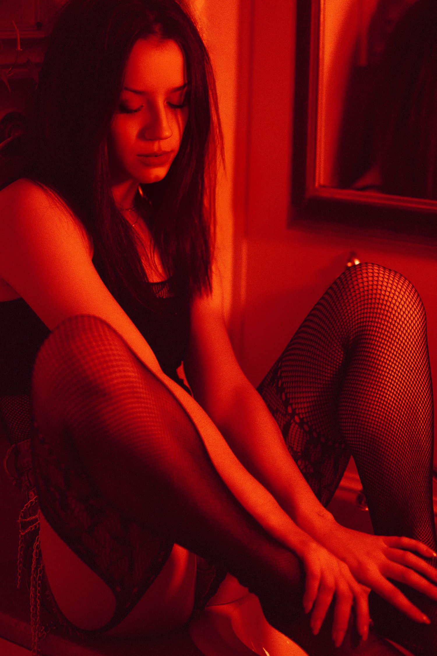
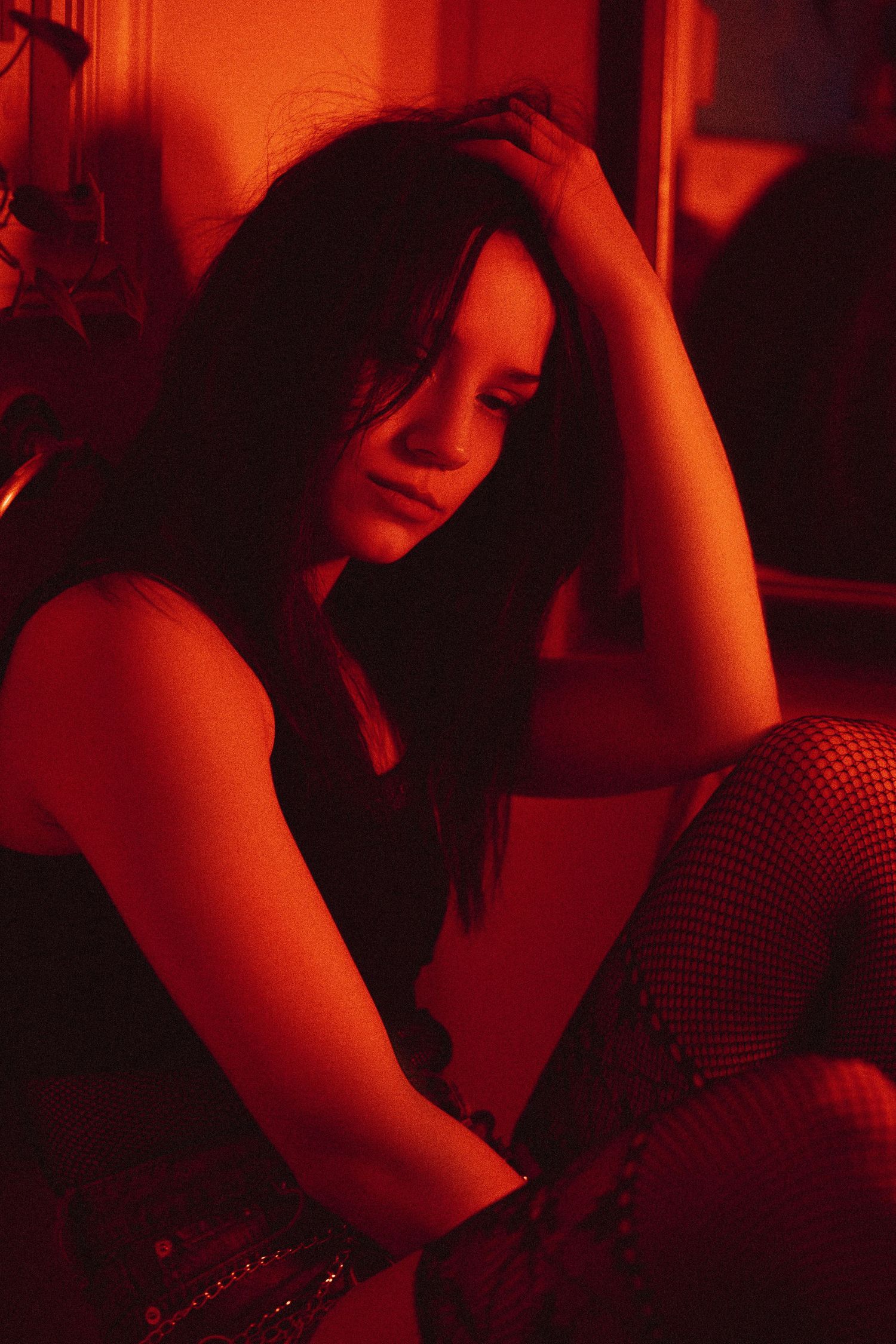
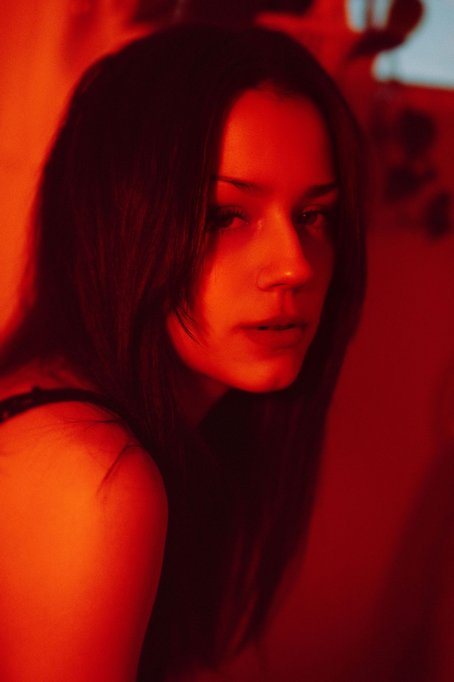
This was fast-forwarded yesterday by me trying to share the following images approximately 5 times to instagram, each time trying different export settings, all to no avail. Most times, the quality that instagram posts is good enough for me to leave up, but this time, I couldn't stand it; All detail was lost, so much noise added, colours faded, etc etc. After more time than I care to admit, I gave up, feeling really disappointed as I am quite proud of these images.
This was my first time using a colour gel for portraits, and definitely won't be my last. The space we shot in was Marielee's small bathroom, so the space to move around and good angles were limited. I shot all of these with my 85mm 1.8 prime lens, but if I could do it again I would definitely toss in some shots with my 35mm 1.4 for more variance.
Not a lot needed to be done to these in post-production. I added a bit of a pinky-red to the shadows to enhance the red, and cyan-green to the midtones which I also lifted a bit to increase contrast in colours. For final touches, I added some noise and grain, and some of texture overlays.
After staring at these images for hours, my natural white-balance was definitely off for a while, but I was really stoked with my results.